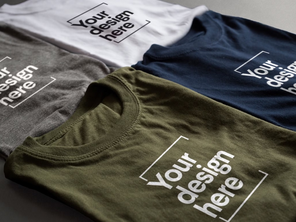
Everyone loves great t shirt designs. What makes a great design? What makes a T-shirt that people want to wear again and again?
Simple designs make the best designs. However, even the most basic designs can be great if they do the right things and avoid common mistakes.

This article will outline the top 5 important things to consider when designing your printed masterpiece. While some of these may seem obvious to you, others might be new. So continue reading to learn more.
T-shirt Design Tips to Not Make Mistakes
Sizing
Sometimes, size doesn’t matter in life. In T-shirt design, it matters a lot. However, most people will stick with the standard size.
The thing is that size should be determined based on the design and the fabric to be printed.
Your design can appear larger than it needs to, depending on its shape. For example, square or circular shapes look best when smaller than the standard size.
People often print their designs on regular paper at home and then hold them up to their shirts to see how they look.
Another thing to consider is what garments or items will be printed. Some items may have a restricted print area. For example, hoodies with pockets in the front have a maximum height of 10 inches, while some toddler tees are only 6 inches wide.
Placement
Sometimes, print placement can be confused with the location. But it is the exact measurement of the area where the design will be printed.
If your design is so striking that people notice it, but the placement is not right, they will start to pay less attention. For example, the belly print is a common error that is not flattering.
Fonts & Typography
At its most basic, typography is the visual component of the written text. Typography is not the text, but any time text is printed or displayed, it includes some level of typography.
Typography is the art of arranging a type in a manner that makes sense. It also includes choosing fonts and ensuring that the spacing between the letters and lines is correct.
Your choice of font can significantly impact how your design is received. It can convey certain ideas or evoke emotion that may not be intended. We’ve all seen ads, logos, and graphics for a long time, so we are all conditioned to attribute certain fonts.
For instance, if you’re designing a mothers day t shirt, you should avoid “Comic Sans” if your goal is to look more professional or corporate.
Standard fonts can be used for almost any purpose. Some fonts are only suitable for specific situations.
Many fonts have names that begin with “A” or B. This tells us that you probably didn’t spend much time choosing your font. Explore all your options!
Composition
You may have learned about composition in high school art classes. Each design contains elements that are placed in relation to one another. This is the basis of the overall composition.
Sometimes, it is difficult to determine what constitutes a well-designed composition. However, some basic rules of composition can dramatically improve the design.
Too many elements or too few are common mistakes. The entire design could be out of balance, drawing the eyes to the wrong places. You should also be careful if the font is not in the correct order.
Yeah. If you are working with many elements, take the time to put effort into your composition. Ask for feedback from others. You can be happy later if you don’t worry first.
Image Quality
This is a common problem with customer-submitted art files. Images are often of low resolution. As a result, they don’t have enough information per pixel to provide the quality and details needed for high-quality print quality.
Images found on the internet are often too small. Images from the web are usually 72 dpi and cannot be printed full size. Images should be at least 200 dpi when printed full-size.
Low-resolution images can also have visible artifacts due to their compression. These artifacts can sometimes be difficult to see unless you zoom in.
You can submit a vector file. The resolution doesn’t matter; vector files scale perfectly to any size without sacrificing quality. We love vector files so much. Vector files can be PDF, EPS, or AI file types.
Photographs are another issue that can affect image quality. There will be blurriness and awkward cropping. Sometimes we receive a phone picture and a screenshot from a computer. That’s w7hat I did. It’s almost like the Inception of submitted artwork files.
For best results, it is recommended that photographs be scanned in high resolution.
Conclusion
I hope these tips will help you avoid common mistakes when it comes to printing on your t shirts.